Tuesday, 6 May 2008

Grid and Layout

I have been given a brief to re-design a magazine page layout.
In order to do this I had to deconstruct the existing page (page 36 Death of analogue – WTF Magazine).
My page was structured with 6 columns and 4mm gutters. I used the original grid layout of the magazine so that it would be suitable to replace the old design.

death of analogue original

page 37 thumbnails

I have removed “analogue at a glance” because it is the start of the article. I wanted to improve its impact by giving it a title page style, and felt that the section “Analogue at a Glance” would be best suited on the next page with the “Digital Switchover” section…
The reaper was deleted because it was cheesy and I thought just leaving his hand resting on top of the TV was enough to get the concept across.

Picture 4

Wednesday, 16 April 2008

Black Cab


The second graphic Devise inserted into my "Taxi Driver" Enelope

Tuesday, 15 April 2008

Daily Monster

YouTube - 344 Daily Monster 94 (of 100)


Daily Monster: 1 Man Loads of Monsters

All created in this Ink blot style and all look ace, check them out at youtube.com

Dark Days

This Film Is Amazing!

This is the story of some remarkable people who live on the underground in America.
Their Underground shanty town means that they can do what they want when they want and although they have sad storys, they are happy with what little they have. These people are inspiring and i would advise everyone to watch it.

McCain Potato Parade

McCain are inviting every one to join in with the potato parade!

Picture 15

"Created in collaboration with Aardman Animations, the Oscar winning team behind Wallace & Gromit and Chicken Run, and the digital whiz kids from glue London, the challenge was to make an interactive animation with stop-frame characters based around the importance of a McCain specially selected potato!"

The Interactive bit of fun graphics enables you to create and edit your own potato parade and send it to your friends indox.

these little cute spud characters put a smile on my face and hopefully they will do the same to you

to find out more visit www.potatoparade.co.uk

Primus - The Devil Went Down to Georgia

http://www.youtube.com/watch?v=3FRtkek-Et4

This Video is a Primus song, as it has been made by the universal music group it cannot be embeded onto my blog but follow the address above to view.

The Song featuring a fiddle battle between a man (Johnny) and the devil. the animation of this video is impeccable especially for the type of video it seems that most animated music videos or at least animated sections of music videos lack the clean professionalism of block buster animation which this captures. not only is it really well done but i found it hilarious.

Monday, 14 April 2008

Visual Language 2

This animation uses line thickness to investigate depth and was the second step in my visual language personal development:

Visual Language

Personal Development.
My visual language was focused around 3 objects (inhaler, spray cap and mobile) and the effect of line when looking at depth. using 6 pens.
i found it difficult to work without a final piece in mind so decided to draw the rotation of these 3 objects, animated here:

Monday, 3 March 2008

Named and Shamed

grafik 160
IMG_0354


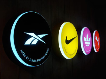
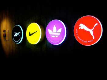
I found this in grafik magazine, i always like work like this, the attack at corporations or just at humanity as a whole in a protesting manner inspires me.
Graphics in general is communicating in a visual way, i think that if anything is worth communicating it should be messages like these, things that build awareness and have real meaning and morality behind them. telling people the truth about were things come from, who its hurting and who is gaining from them gives people a better understanding of how the world works. If you can do this in a visual way that captures, or even confuses people enough to read further into it then you should, there are a lot of things wrong with the world and pointing them out to people can be alot of fun too.

Wednesday, 27 February 2008

Photoshop brief

Brief: Design a set of 10 x A6 images which illustrate what i have learnt since November. These are my 2 favourite out comes: (Canned food is ace and how to develop film)

tins

develop film

Lemon Jelly - The Staunton Lick

This was the final video from my video elective, the brief was to make a video which was based around a piece of music. We decided to base ours on a day in the life of Leeds. Not someone living in Leeds but Leeds City Center as a whole.........enjoy!

News Papers

I was asked to illustrate 3 similar stories from The Guardian, The Daily Mail and the Daily Mirror, on the 22nd October 2007. The story i chose was the use of batons in prisons on 16year old offenders. The Daily Mail made the prison officers out to be out numbered and threatened by the prisoners. The Daily Mirror made the guards seem to be overly violent and demanding. Finally the Guardian simply posed the question do they really need batons? From this experience i have decided to never read an opinionated newspaper again as the story can sway so drastically from one to the next.

newspaper illustrations

From this we had to take the style and opinion of one of the newspapers and develop the story into an informative poster design. I chose the guardian as it was neutral and like me didn't seem to know what would be the best out come. Through my development i neutralized everything so that the out come had no opinion what so ever, keeping only the font from the guardian (Times New Roman) and these were the out come:

does?3does?7does?4

Monday, 25 February 2008

How to Escape an Evil Teddy

Earlier in the year i took part in a Video Elective, the 1st project was a "How to..." video, and here it is:


Keep watch for the final project (Lemon Jelly Music Video) which will be posted soon.

100 Pockets

Here are the 100 pockets which i am using as a starting point for my book, i have simply asked people if i could take a picture of what they have in their pockets, it was interesting to find the diversity of content and also how unwilling some people are to help. To those people who refused to be photographed, i hope you all got to hell for making my life that little bit harder for something so trivial as a picture of your hand. You got to hell.... you got to hell and you die!
Many thanks to everyone else who was kind enough to participate.

Wednesday, 6 February 2008

Giant Panda!

Life is a Laugh

Life is a Laugh was a Platform for art installation on the London Underground,created by Brian Griffiths along with a 24foot panda head, caravan, mattresses, makeshift ramps and stunt hoops came its very own advertising campaign by Fraser Muggeridge. The Poster and leaflet designs made to accompany the installation work within the London Underground's brand guidelines do the opposite to the installation, a boring and timeless design uses irony to illustrate the humor of the piece.

Fraser Muggeridge quotes:
"I had a great title to work with (i.e. Life Is a Laugh), so by doing a poster that was nearly boring this would be more amusing, more of a laugh-and people would notice it more by its blandness and get interested in the project"

"It conforms to all the guidelines and i made it look slightly old and grubby, so that you're not quite sure what era it dates from. a bit like Brian's (Brian Griffiths) work"