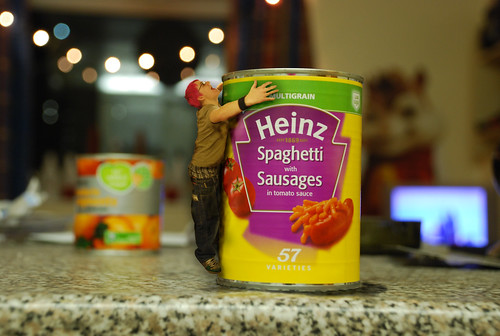
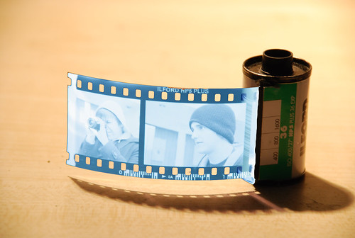
Brief: Design a set of 10 x A6 images which illustrate what i have learnt since November. These are my 2 favourite out comes: (Canned food is ace and how to develop film)
Wednesday, 27 February 2008
Lemon Jelly - The Staunton Lick
This was the final video from my video elective, the brief was to make a video which was based around a piece of music. We decided to base ours on a day in the life of Leeds. Not someone living in Leeds but Leeds City Center as a whole.........enjoy!
News Papers
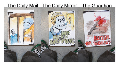
I was asked to illustrate 3 similar stories from The Guardian, The Daily Mail and the Daily Mirror, on the 22nd October 2007. The story i chose was the use of batons in prisons on 16year old offenders. The Daily Mail made the prison officers out to be out numbered and threatened by the prisoners. The Daily Mirror made the guards seem to be overly violent and demanding. Finally the Guardian simply posed the question do they really need batons? From this experience i have decided to never read an opinionated newspaper again as the story can sway so drastically from one to the next.
From this we had to take the style and opinion of one of the newspapers and develop the story into an informative poster design. I chose the guardian as it was neutral and like me didn't seem to know what would be the best out come. Through my development i neutralized everything so that the out come had no opinion what so ever, keeping only the font from the guardian (Times New Roman) and these were the out come:
Monday, 25 February 2008
How to Escape an Evil Teddy
Earlier in the year i took part in a Video Elective, the 1st project was a "How to..." video, and here it is:
Keep watch for the final project (Lemon Jelly Music Video) which will be posted soon.
100 Pockets
Here are the 100 pockets which i am using as a starting point for my book, i have simply asked people if i could take a picture of what they have in their pockets, it was interesting to find the diversity of content and also how unwilling some people are to help. To those people who refused to be photographed, i hope you all got to hell for making my life that little bit harder for something so trivial as a picture of your hand. You got to hell.... you got to hell and you die!
Many thanks to everyone else who was kind enough to participate.
Wednesday, 6 February 2008
Giant Panda!
Life is a Laugh
Life is a Laugh was a Platform for art installation on the London Underground,created by Brian Griffiths along with a 24foot panda head, caravan, mattresses, makeshift ramps and stunt hoops came its very own advertising campaign by Fraser Muggeridge. The Poster and leaflet designs made to accompany the installation work within the London Underground's brand guidelines do the opposite to the installation, a boring and timeless design uses irony to illustrate the humor of the piece.
Fraser Muggeridge quotes:
"I had a great title to work with (i.e. Life Is a Laugh), so by doing a poster that was nearly boring this would be more amusing, more of a laugh-and people would notice it more by its blandness and get interested in the project"
"It conforms to all the guidelines and i made it look slightly old and grubby, so that you're not quite sure what era it dates from. a bit like Brian's (Brian Griffiths) work"
Subscribe to:
Posts (Atom)