I needed something to show in my crit last week so i sumerised the shots and little editing i had done.... here is the result
Thursday 29 May 2008
Speaking from experience animation dev
This is the full animated sequence which will be played over the top of my video footage, as shown from the test in my previous blog.
Look What i Did! :D
Ok very quick test for my current video project "Speaking From Experience" and looks crappy because it was compressed for youtube. But i was so happy when i figured out how to overlay Animation on top of video that i had to share it with the world :D A-ha (Take on Me) Eat your heart out.
Enjoy...
Enjoy...
Friday 16 May 2008
Dave Mckean
Dave Mckean's Arkham Asylum.

This is a page from Arkham Asylum, Dave Mckean's Illustrations
have depicted the dark night darker than ever before. I love these
illustrations, the vivid reds and greens contrasted with the Moody
dark blue surroundings create an undeniably evil Joker. The
slightest shadows and highlights hinting at the presence of BatMan
but never actually showing him in his full form creates a Mystery
which is lacking in other batman comics, generally due to over
dramatising.
Don Hertzfeldt Bitter Films
One of Many Bitter Films Animations
very very funny but also very strange.
very very funny but also very strange.
Search for Inspirado [Speaking From Experience]
Currently i am working on my "Speaking From Experience" Brief and looking at video/animation techniques, i am hoping to incorporate animation with filmed footage and stop motion photography. These are just a few examples of such work that I found on my search for inspirado.
A-ha Take On Me
I would just like to state that in no way do I condone listening to A-ha, I do not like this song but the technique used in the video is something which intrigues me.
Chumbscrubber
Only looking at the 1st couple of minutes (House sequence)
Juno Intro
A Scanner Darkly
A-ha Take On Me
I would just like to state that in no way do I condone listening to A-ha, I do not like this song but the technique used in the video is something which intrigues me.
Chumbscrubber
Only looking at the 1st couple of minutes (House sequence)
Juno Intro
A Scanner Darkly
Tuesday 6 May 2008
Grid and Layout
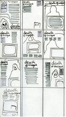
I have been given a brief to re-design a magazine page layout.
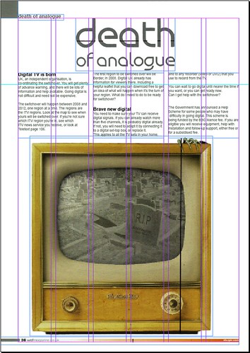
In order to do this I had to deconstruct the existing page (page 36 Death of analogue – WTF Magazine).
My page was structured with 6 columns and 4mm gutters. I used the original grid layout of the magazine so that it would be suitable to replace the old design.
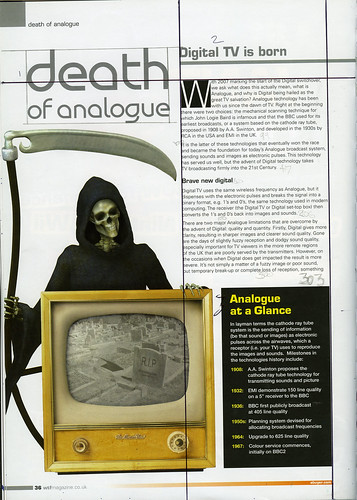
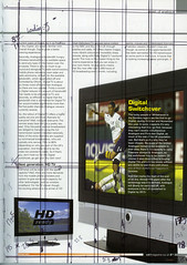
I have removed “analogue at a glance” because it is the start of the article. I wanted to improve its impact by giving it a title page style, and felt that the section “Analogue at a Glance” would be best suited on the next page with the “Digital Switchover” section…
The reaper was deleted because it was cheesy and I thought just leaving his hand resting on top of the TV was enough to get the concept across.
In order to do this I had to deconstruct the existing page (page 36 Death of analogue – WTF Magazine).
My page was structured with 6 columns and 4mm gutters. I used the original grid layout of the magazine so that it would be suitable to replace the old design.
I have removed “analogue at a glance” because it is the start of the article. I wanted to improve its impact by giving it a title page style, and felt that the section “Analogue at a Glance” would be best suited on the next page with the “Digital Switchover” section…
The reaper was deleted because it was cheesy and I thought just leaving his hand resting on top of the TV was enough to get the concept across.
Subscribe to:
Posts (Atom)
