Monday, 4 May 2009
Monday, 27 April 2009
Batman
This is one of the best animated intro sequences from my childhood, i love the imagery and that the narrative completely sums up the content of the program. plus Batmans a bad ass.
Saturday, 18 April 2009
Nyle "Let The Beat Build"
Nyle "Let The Beat Build" from Nyle on Vimeo.
This video was apparently filmed in one take, with audio being recorded simultaneously with the film. The video features Nyle (www.nyleraps.com) and is produced by Last Pictures (www.last-pictures.com) and 194 Recordings (www.myspace.com/194recordings)
I love the narrative and the overall mood of this video, the way that "the beat builds" is awesome, and love the use of instruments rather than samples.
The spot lighting captures the mood of a recording studio perfectly and finishes with a low key spot light on the artist, blacking out the rest of the room for a really dramatic finish.
I am also a fan of extended shots in general and always impressed at the ones which work without any flaws, something which is very hard to achieve. If this video was done in one take i am incredibly impressed and the producers should be proud as its clear a lot of planning must have gone into pre-production.
Sunday, 29 March 2009
Wednesday, 21 January 2009
Tuesday, 9 December 2008
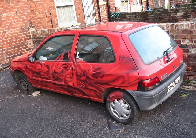
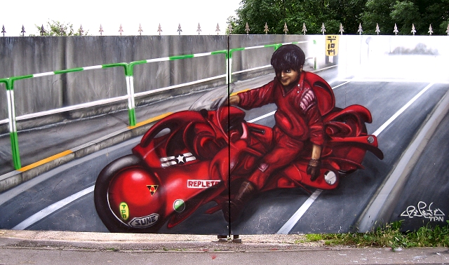
Replete
I have recently stumbled across this graffiti writer called Replete, having seen some of his work around Leeds (Hyde Park area) i recognized his style when i found his website. i love the intricacy in his pieces and his illustrative style. Check out www.repletes.net to see more of his work.
Tuesday, 25 November 2008
Evaluation Year 2 Module 1
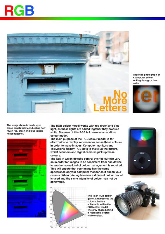
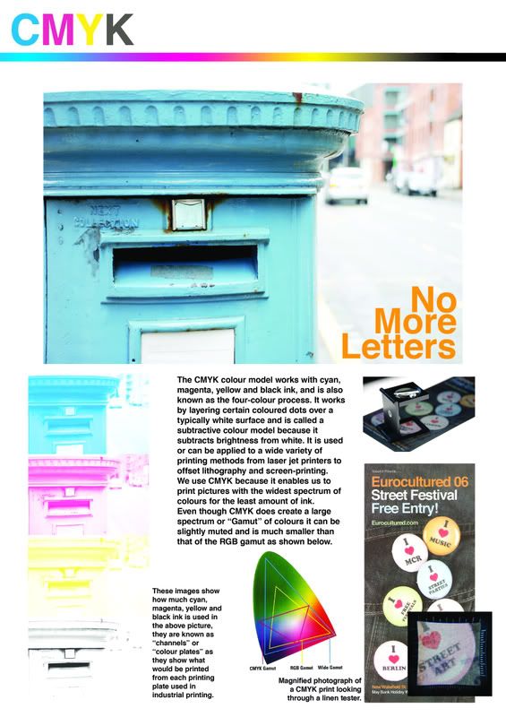
Through out this brief I have learnt all about the Print process and different colour models, to the extent that I can recognise methods of printing. And also how to use these methods effectively.
I have found that I like the ability to analyse prints and pick them a part. Knowing what your looking at and thinking of the design process which must have taken place gives the print so much more meaning, especially when looking at colour models as the different types of ink hold such influence on the design.
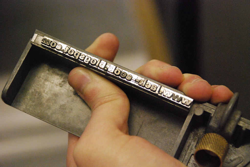
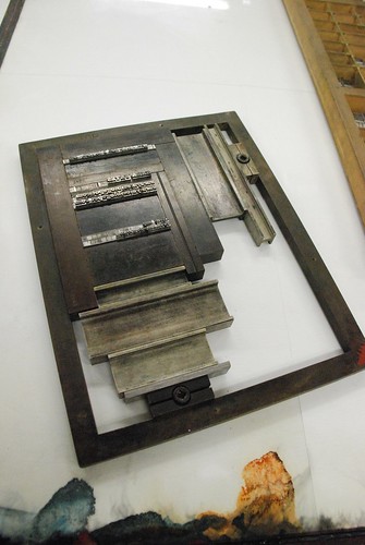
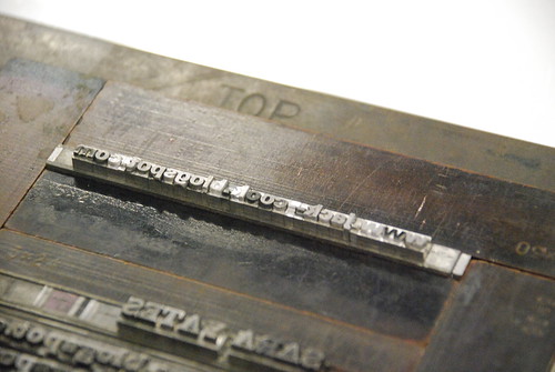
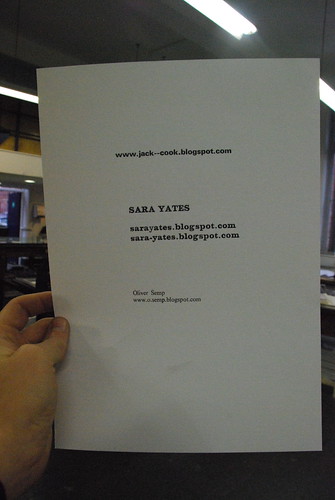
I took part in a workshop which taught me how to letterpress, were I produced my blog address using this print method. I also learnt the different uses of letterpress. In addition to this I had an induction into screen printing and printed a poster.
Although I didn’t implicate these print methods into my designs in this module I look forward to using them in the future.
I have developed my photography, both of moving people and my work, learning how to take, light and frame photographs. I have also been developing my understanding of type through typography seminars and used what I had learnt through my designs.
This module I have learnt that I enjoy learning skills and practical processes, creating a better understanding of things so that I can pick designs apart to reveal how they were made.
My strengths through this module were my understanding of colour models and print processes.
And I feel I need to improve on my typography and layout. Especially when developing layouts.
If I was to do anything differently next module, it would be to organise my time and work more. I would also develop an even greater understanding of my target audience, which in addition would be defined much earlier.
I have found that I like the ability to analyse prints and pick them a part. Knowing what your looking at and thinking of the design process which must have taken place gives the print so much more meaning, especially when looking at colour models as the different types of ink hold such influence on the design.
I took part in a workshop which taught me how to letterpress, were I produced my blog address using this print method. I also learnt the different uses of letterpress. In addition to this I had an induction into screen printing and printed a poster.
Although I didn’t implicate these print methods into my designs in this module I look forward to using them in the future.
I have developed my photography, both of moving people and my work, learning how to take, light and frame photographs. I have also been developing my understanding of type through typography seminars and used what I had learnt through my designs.
This module I have learnt that I enjoy learning skills and practical processes, creating a better understanding of things so that I can pick designs apart to reveal how they were made.
My strengths through this module were my understanding of colour models and print processes.
And I feel I need to improve on my typography and layout. Especially when developing layouts.
If I was to do anything differently next module, it would be to organise my time and work more. I would also develop an even greater understanding of my target audience, which in addition would be defined much earlier.
What is the job of a graphic designer?
I was asked: What is the job of a graphic designer? and what is your price?
I think everyone will have a different answer to this question but in my opinion the job of a graphic designer is to fulfill the brief given to you in the best possible way, always striving for better and better designs. If every designer keeps improving then the world would be massively improved in a design sense. It is not a designers job to turn their nose up at seemingly boring jobs (e.g. dog food) or even just to nock it out as quick as possible to pay the bills. it should be their obligation to try and fulfill the brief with the best possible way in terms of both clarity of message and aesthetic. Whilst doing this designers should always keep in mind the environmental issues of design, as 'we' as designers produce the adverts and packaging etc which surrounds us we should strive to keep it to a minimal, ensuring as little waste as possible and using recycled materials to their full potential.
To the second question "what is my price?" i have thought for a long time that a job pays the bills and you should fulfill any and all requirements of the job (in a design sense only) but when asked if i would have designed the swastika if it was asked of me, or even if i was asked to design something for the BNP or BPP no matter how big/profitable the job i think i would have to refuse.
In the swastika sense that probably would have meant my life, but i honestly couldn't let my work be associated with such a cause.
My only hope is that this job doesn't kill me.
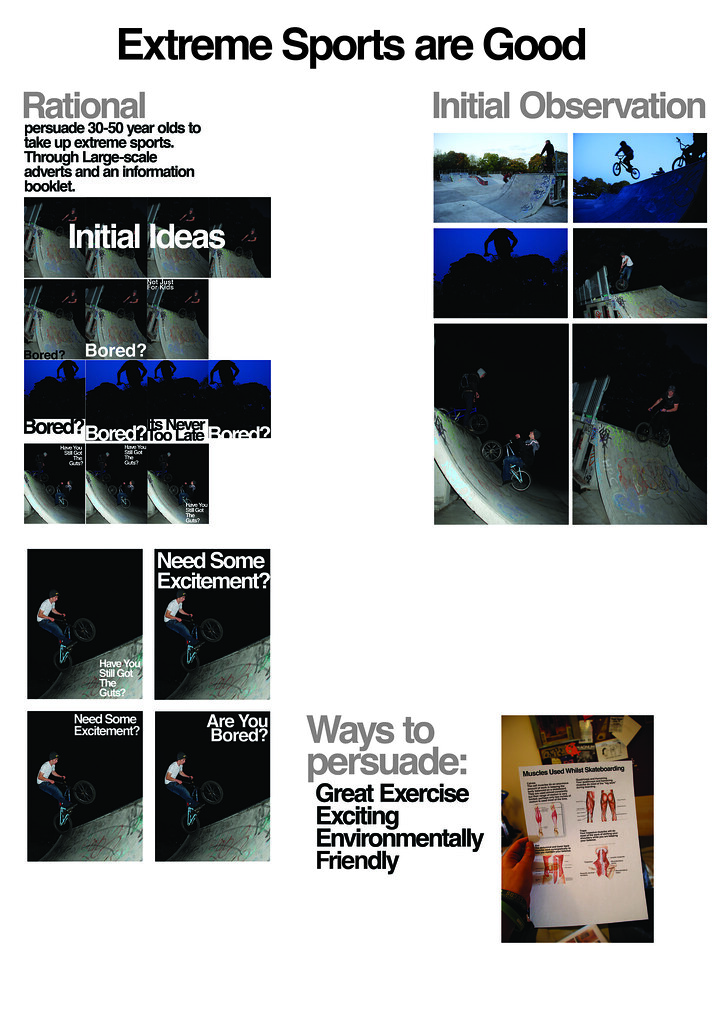
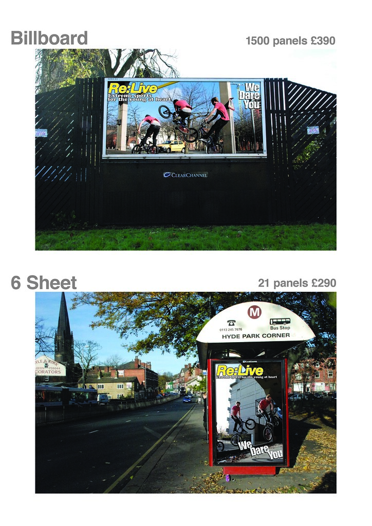
Good Brief: A2 Presentation Boards
Here are 6 A2 Boards designed to explain the main development stages of my "Good" brief. please click on the images to view them fully.

Sunday, 23 November 2008
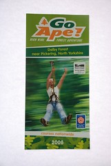
Good Brief [Re:Live Brochure]
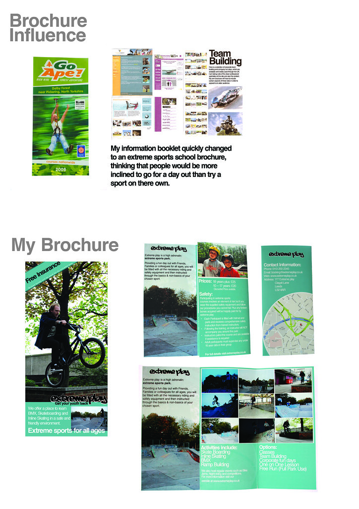
Main influence for original brochure
My Original Brochure Cover
Inside
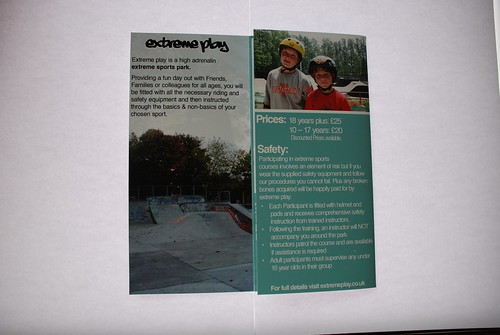
Back
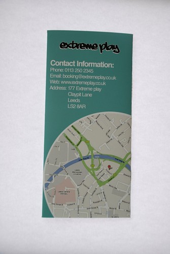
At my tutorial we decided that the brochure name "extreme play" was appealing to the wrong audience, it was too young and needed to invoke nostalgia on an older audience, this led me to look at 80's type.

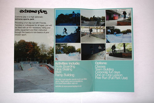
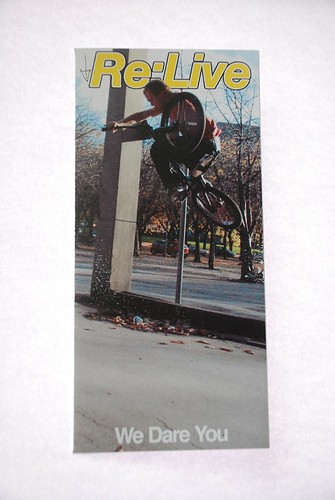
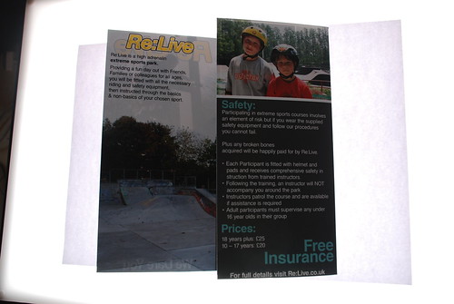
New Design

In my crit we came to the conclusion that this Design is to boring and the colours too vibrant, the brochure looks like its been made by the council and as a design is just dull, in order to improve it, i had to impress my audience, meaning new photography. i also needed a tag line of some kind to lure people in. and in order to persuade an even older audience i researched 70's fashion and music culture. This was the Result:


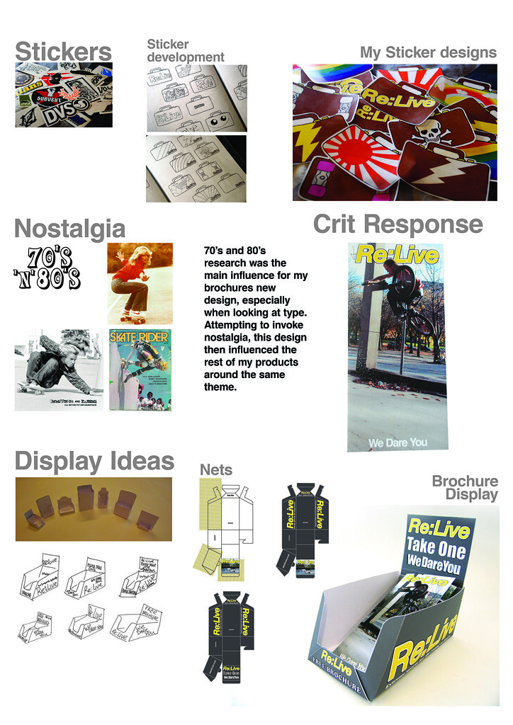
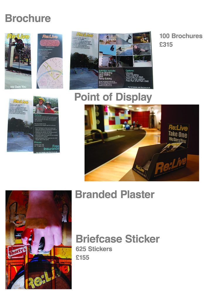
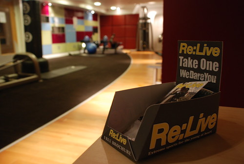
Brochure in Display


Final Brochure in Display, in Situ
My Original Brochure Cover
Inside
Back
At my tutorial we decided that the brochure name "extreme play" was appealing to the wrong audience, it was too young and needed to invoke nostalgia on an older audience, this led me to look at 80's type.
New Design
In my crit we came to the conclusion that this Design is to boring and the colours too vibrant, the brochure looks like its been made by the council and as a design is just dull, in order to improve it, i had to impress my audience, meaning new photography. i also needed a tag line of some kind to lure people in. and in order to persuade an even older audience i researched 70's fashion and music culture. This was the Result:
Brochure in Display
Final Brochure in Display, in Situ
Saturday, 15 November 2008


Wednesday, 12 November 2008
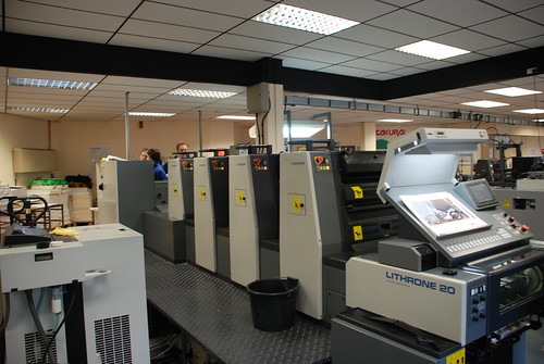
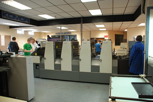
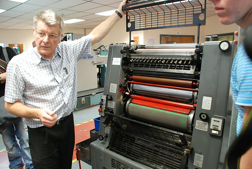
Offset lithography
Offset Lithograhy
Four colour process lithography machine
Ink Rollers

Quality Check Point
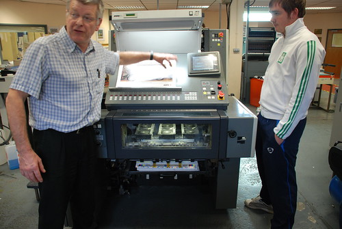
Two colour offset lithography machine

Four colour process lithography machine

Ink Rollers
Quality Check Point

Two colour offset lithography machine
Tuesday, 14 October 2008
Wooster Collective
Truth: Prato Italy
 pulawy poland 2006
 wroclaw poland 2005

Some pretty cool stuff from Truth, i found this via the Wooster collective and love this kind of environmental altering via design. It makes me happy to see people stretching their imaginations around the idea of graffiti and making it more than just painting on a wall.
to find more visit: www.truthtag.com
pulawy poland 2006wroclaw poland 2005Some pretty cool stuff from Truth, i found this via the Wooster collective and love this kind of environmental altering via design. It makes me happy to see people stretching their imaginations around the idea of graffiti and making it more than just painting on a wall.
to find more visit: www.truthtag.com
Subscribe to:
Posts (Atom)
